Drag Race- Logo Design
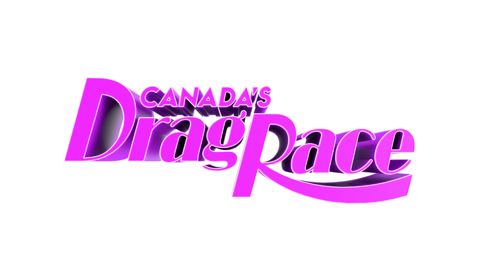
Logo design
Queens of the North, Come Through! In 2019, Crave Announced a New Original Series, Canada’s Drag Race. This marked Canada’s first foray into the Drag Race franchise. Previously only Rupaul’s Drag Race, and Drag Race Thailand were existing. When I heard we were launching this new series, I’m jumped at the chance to design the logo. With the goal of ensuring we had a workmark that lived up to its iconic original counterparts.

Previous Existing Logos

The goal was to keep the same visual language and letterforms found in the Original Rupaul’s Drag Race logo. Following choices previously made to ensure Canada felt like it belonged in the Rupaul family. Taking main queues from the letter ‘R’ and ensuring the same shapes appear in the letter ‘D’.
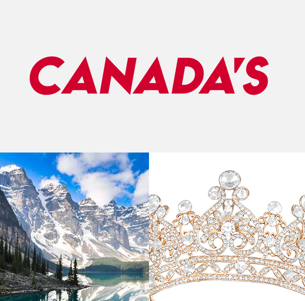
For the word Canada I went with a geometric typeface, where the A(s) mimic the Canadian mountains and the crown.
Logo in use

Base logo FOR the franchise

Canada’s Drag Race was the beginning of multiple iterations of the franchise around the world. It’s great to see that my logo is the base for all Drag Race logos here after, each with their own unique take created by their own design team.
CREDIT
Logo Design: Ronald Ruiz
Broadcast Show Open & Graphics Package, 3D logo render: Feather Studios Toronto
Season 1 Artwork: Bell Media Studios, Niko Papadimitriou